


For this project, everyone in class was assigned a different company to rebrand, and I was given Chick-fil-A. We had to do some research on the company before we began, and I compiled the following information from Chick-fil-A's website:
- Chick-fil-A is and has been family owned since it's inception
- Chick-fil-A is a play on 'chicken fillet'
- The 'A' in Chick-fil-A is symbolic of the "Grade A top quality" chicken used in their chicken sandwiches
- The company has undergone 7 logo changes
- "Eat Mor Chikin" is Chick-fil-A's slogan
- The hex codes for the 2012 logo are DB1F37(red), 000000(black), and FFFFFF(white)
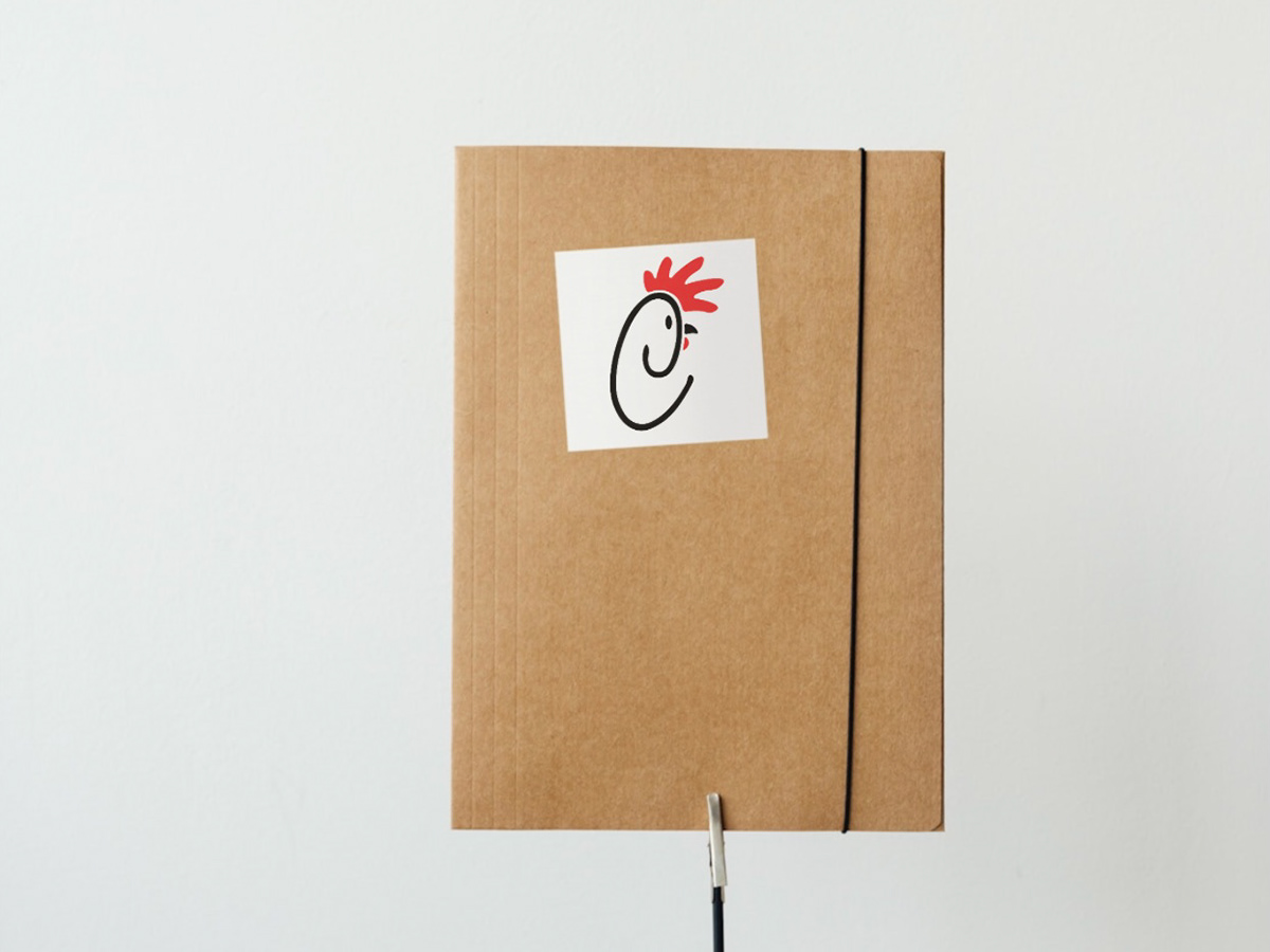
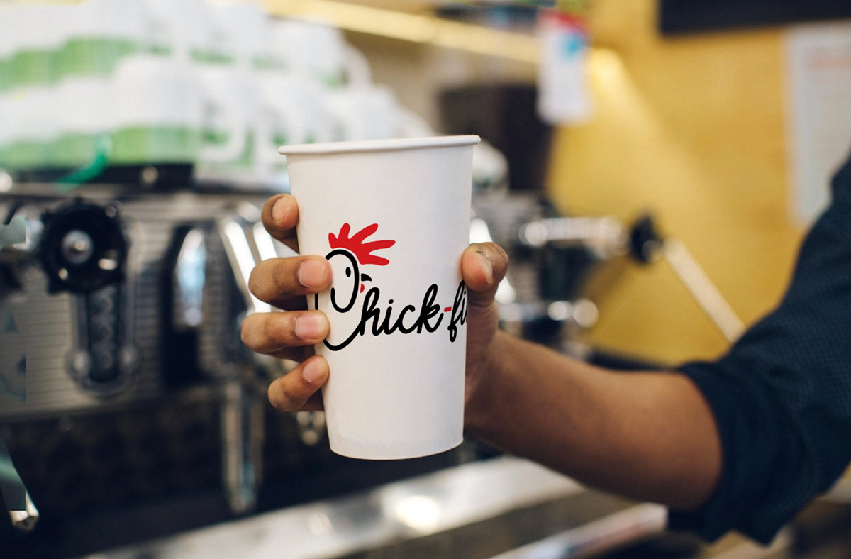
Because the original logo is already so prominent and well-known, I decided to opt for slight modifications as opposed to scrapping everything and making something entirely new. I was drawn to the company's 1963-1964 logo the most. It feels old school and homey, almost nostalgic in a way, and reminds me of those old but comforting family owned diners and burger joints you see in small towns on road trips. I particularly liked the thin script font and the use of red in the second logo as it really worked to make the logo pop without being too overbearing or distracting. Because of this, I decided to do something similar. I chose a font (Creativo Italic Italic) that remained faithful to the current logo and that was still recognizable as Chick-fil-A, but I intentionally chose something that had a fine and vaguely handwritten look. The capital 'A' is in Cullomty Regular, but I slightly edited the A to make it stand straight up rather than lean at an angle. The font beneath the logo is Simpsonfont (I did not realize it had anything to do with the Simpsons until after the fact), which I chose because it resembles the hand painted letters you see on the company's cow billboards. I added red to some parts of the logo so it wouldn't look as bland. The red I chose is FF0000, which is the same shade as the 1975-1985 logo. I chose this red because it looks bold and vibrant when compared to the duller and less lively red that came in later logos. I also chose to make the comb (the frill on the chicken's head) look more like a real rooster's comb so the logo would look moderately less soulless and corporate (and less like a foot too). In addition, I changed 'Chick-fil-A' into 'Chick-fill-A' because the name is supposed to sound like chicken fillet, and I feel like that gets lost without the double l's. One thing I wish I could have included but wasn't able to was making the 'A' look like an 'A+' to better represent their claim of using grade A top quality chicken. I planned on doing this by making the line that crosses through the A only cross through the right leg, but unfortunately the logo looked too busy when I tried this and it was hard for my eyes to know whether to look at the left or the right, so I left it as it is.


